Advanced Typography Task 1
23/8/2021-13/9/2021 (Week 1-Week 4)
Name : Chan Huei Lian (0351597)
Advanced Typography | Bachelor of Design in Creative Media | Taylor's University
Task 1
LECTURES
Week 1 : We were briefed about the Module Information Booklet, and Mr. Vinod explained the first task for us, which is the typographic system and showed us examples of previous students' works for a clearer understanding. We then did practical work during class, which Mr. Vinod asked us to design the first typographic system, which is Axial system using the information given. After about 45 minutes, we uploaded our design on facebook and Mr. Vinod made some comments and advice for us.
Week 2 : We uploaded our first attempt works on Facebook, Mr. Vinod consulted us about our designs on typographic system.
Week 3 : After a brief consultation with typographic systems, Mr. Vinod briefed us about our second task, which is Finding Type. He showed us examples of works, and ways on how to do it.
Week 4 : The class started with consultations with Finding Type exercise, then Mr. Vinod briefed us about our next task, which is Type and Play, he showed us examples of works and ways to complete it. Then, the session continues with peer evaluations and feedbacks which allows us students to give and receive feedbacks to each other.
INSTRUCTIONS
Module Information Booklet PDF.
<iframe src="https://drive.google.com/file/d/18R4RiOQrYJvKhhUdRHv8usUxK3n8xHh6/preview" width="640" height="480" allow="autoplay"></iframe>
TASK 1 : Exercises - Typographic System | Week 1
Figure 1. First try of the Axial system done during class practical session.
Figure 2. Trials and errors progress of radial typographic system.
Figure 3. Dilatational system progress.
Typographic System First Attempt Compilation.
Figure 4.1a - Axial system 1
Figure 4.1b - Axial system 2
Figure 4.2a - Radial system 1
Figure 4.2b - Radial system 2
Figure 4.3a - Dilatational system 1
Figure 4.3b - Dilatational system 2
Figure 4.4a - Random system 1
Figure 4.4b - Random system 2
Figure 4.5a - Grid system 1
Figure 4.5b - Grid system 2
Figure 4.6a - Transitional system 1
Figure 4.6b - Transitional system 2
Figure 4.7a - Modular system 1
Figure 4.7b - Modular system 2
Figure 4.8a - Bilateral system 1
Figure 4.8b - Bilateral system 2
Second Attempt Typographic System
Final Typographic System
Figure 6.1 Axial System
Typographic System With Grid and Guides PDF.
Typographic System PDF.
*Approximately 40 hours in 3 weeks spent on designing this task.
FEEDBACK (Typographic System)
Week 1
General Feedback : Always be careful of the leading points (< 3pt of body copy size) and body copy point size, which is 8-12pt.
Specific Feedback : Adhering to axial system. Interesting non-element object on sides.
Week 2
General Feedback : Random system should be arranged to look like chaos at the first sight, but as you closely look at it, it should have an order or a pattern that's readable. Numerical typefaces should be decreased on its size by 0.5pt.
Specific Feedback : For axial system, the title and the sub-title must be transitional to each other to guide readers to look at information in order. For radial system, interesting work, non-element object attracts viewers to look from top to bottom, but can change its colour fill to only outline to diminish its dominance.
Week 3
General Feedback : Those who are struggling with random system can refer to Dadaism, David Carson, Jackson Pollock, and Cubism's artwork.
Specific Feedback : For random system, focus on how to position or concentrate the mess. Random system is actually like fine art. For the non objective element, reduce the outline by 0.5 so that it does not overpower the texts. Good job on axial, dilatational, modular. Others are good to go.
REFLECTIONS
Experience : Initially, I struggled a lot in this exercise as I was exposed to many new typographic systems that I was not aware of. At the same time, I was feeling excited to learn more about each type of them and the styles. It was very interesting to see how the same piece of information can be designed into so many different styles by only using typography techniques. The one that I struggled the most is the Random System. It was hard for me to create an artistic chaos in typography and at the same time remains readable and aesthetically pleasing.
Observations : This exercise definitely helped me to become more creative and has enhanced my design sense greatly. It also enable me to be more confident when designing works related to typography and be more versatile to it. I also learned to be critical and objective on evaluating my own artwork and also incorporate feedbacks given by the lecturer to my classmates into my design and find out my problems for refinements.
Findings : I realised that typography could be really fun and exciting through this exercise. Although I still have a lot to improve on and learn, it was a challenging and fun experience. Watching supplementary videos by the lecturer really helps me to understand better about the rules of the typographic systems, thus enable me to complete the task effectively. Feedbacks given by our lecturer, Mr. Vinod are also very helpful for me to recognise the blind spots of my works, and even detailed problems that seems unnoticeable to me.
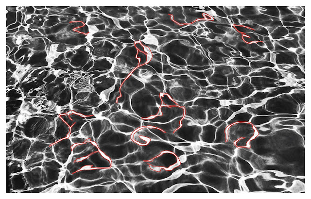
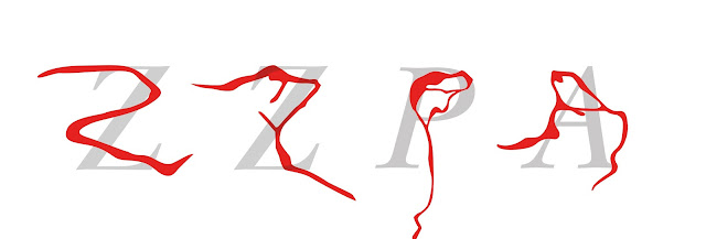
Alphabetic letters extraction.
Raw Extracted Letters.
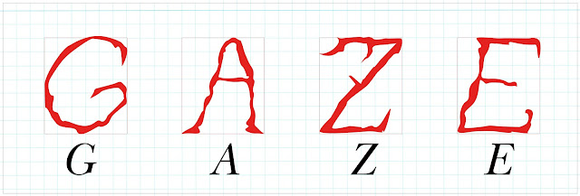
First Refine Process.
Model Font Used : New Baskerville Std Italic.Third Refine Process Version 1.
Third Refine Process Version 2.
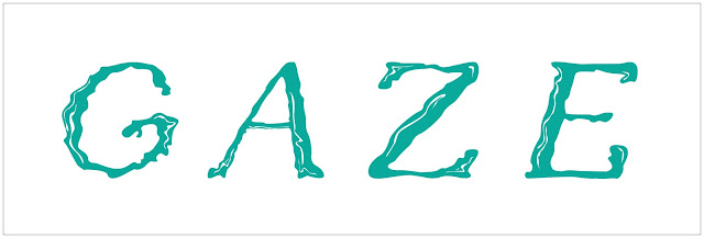
Fourth Refine Process.
* Approximately 25 hours in 2 weeks spent on designing this task.
FEEDBACK (Finding Types)
Week 4
Specific Feedback : To be consistent on the thickness of the stroke, and also retaining back the characteristics of the water ripples in the raw extractions as the original form is not really seen in the refined font. Curliness of the water is a bit lost, feels more rigid and structured than fluid. Too sharp and looks more dangerous rather than having liquidly effect.
General Feedback : We must be able to give critical feedbacks and also receive them as well to be able to improve effectively, as we often have a blind spot ourselves when viewing our own work.
REFLECTIONS
Experience : Initially, I was excited for this exercise because it was unique and interesting. But I came to realise that it is also challenging to do. I had a lot of struggles while doing this exercise, mainly in being consistent in the strokes of the typeface, and retaining the elements of the subject I chose to extract. I realised that I might have chosen a more difficult element extraction to work with, which is water ripples as it requires the design to be more curly and fluid, then having it being block, structured and straight letters. I was having a hard time making the thickest part and the thinnest part of the strokes look consistent in all the alphabets. I even lost track and adapted too early into the model font used, which made it look sharp and structured, and losing the watery feel. After gaining feedbacks from peers and the lecturer, I was able to look into my mistakes and work on it to make it look better.
Observations : This exercise helped me to become more creative and versatile in design skill, as it enables me to incorporate typeface design in any element I might encounter in the future. It also helps me to be more original in ideation when it comes to designing a typeface. I also learned to be more critical in giving and receiving feedbacks, allowing me to improve in both skill and sense in design.
Findings : Through this exercise, I learned to see any element in a artistic and creative way, and create typeface design with it. I still have a long way to go, but this exercise definitely helped me become better. I also became better in viewing my work objectively and improve on my mistakes.
Advanced Typography Exercise 1c : Type and Play | Week 4
*Approximately 3 hours in 1 week spent on designing this task.
FEEDBACK (Type and Play)
Week 5
Specific Feedback : No feedback was given.
General Feedback : Certainty to the right track does not help us learn and explore, do not rely no lecturer's feedback too much, as it will limit your mind to explore more original ideas and hinder your ability to evaluate your own work effectively and find out the problems in your design.
REFLECTIONS
Experience : This was a fun exercise. I struggled and was indecisive at first to find and choose the picture that I wanted to work with, and when I realised it, I wasted too much time and it was already close to the next class session. I found many references and examples of typography infused photography on Pinterest and Google Image to get a better understanding of the task. I did a lot of sketches on different photos, and finally I decided to go with a more manageable photo to ease the time consumed, which is the dancing ballerina with a frilly dress. I had fun using masking technique to infuse the letters into the photo.
Observations : This exercise helped me to pick up photoshop and editing photos again. It also helped me to discover the fusion between photography and typography which I never thought of in the past. Feedbacks given to my peers by lecturer also helped me discover and be more careful with details like shadows and lighting when working on this exercise.
Findings : I found out new possibilities and creative approaches through this task. Another finding is that sketching is very important for ideation. Moreover, time management and effective decision making is also crucial to keep up with a better working timeline.
FURTHER READING
I was able to understand the theory and approaches of the typographic systems in a more in-depth manner by reading this book. The author explains each systems in a systematic but also imaginative approach. For instance, when Elam explained about radial system, she used examples such as petals of flowers, fireworks, domes in architecture and etc. to describe it, allowing me to understand the movement and motion of the different systems when designing.















Comments
Post a Comment