19/9/2021-16/10/2021 (Week 5-Week 8)Name : Chan Huei Lian (0351597)
Advanced Typography | Bachelor of Design in Creative Media | Taylor's University
Task 2 : Key Artwork and Collateral
LECTURES
Week 5 : The class started with consultations with the Type and Play exercise. Then, we were briefed about our next task, which is the key artwork design. We were instructed to use our own name initials to design this task. The key artwork must look like a logo, yet able to stand alone as an artwork to be incorporated into a poster. The session continues with Mr. Vinod having a Q&A session regarding the new task to get us to understand it better.
Step 1: Research
It’s important to know the style you want for your typeface, what different applications it will be used in and who will use it.
If creating a typeface beyond personal use, such as a software package, you may be required to use a Glyphs palette. Glyphs are essentially all available characters in a font – from letters to numbers and special characters.
Fernando says before designing anything, it’s important to research what’s available in the market to ensure relevance and value that your work will have.
Step 2: Drawing and Sketching
This is where a typeface takes its most basic form – essentially, where you create a prototype. Terrance says it’s about capturing the idea as fast as possible.
Many type designers use the traditional toolset of pen (or brush), ink and paper for this step. Others prefer to draw digitally using a Wacom tablet, and some like to work directly in font-design software.
Step 3: Digital Design
This stage happens when you’re ready to scan your letters into software such as Adobe Illustrator for font creation. Manipulate the pixel images and auto trace so the glyphs turn into digital fonts.
Step 4: Testing in Context
Once a working version of the design is ready, test the typeface within its intended context.
This stage can be as equally challenging as getting the design of the shapes right. Expanding the character set, including accent figures and punctuation, might also occur at this stage.
Step 5: Refinements
Recognising the weakness of the design for improvements, explorations and further expansion.
Week 6 : The class started with feedbacks from Mr Vinod with our task 2A. Mr Vinod gave us tips and directions on how to make our designs better and also asked us to choose a job or a type of company if we were not doing design related work, so that we can be clear enough to follow the direction chosen on our key artwork design.
Contrast In Typography
Simply put it is the grouping of two typographical elements, then using different methods of traditional design to create contrast. The contrast places emphasis on the important element of type, letting the secondary element command less attention.
1. Size
This is probably the most common use of typographic contrast and is quite common on blogs and other content that has a time relevance. Many blogs uses this method to provide additional information for those who are interested, but kept it subtle enough where it doesn’t distract or command your attention.
By contrasting large type with small type we get a visually interesting typographical design and it is functional. The most important element commands the most attention, while the secondary element is subtle yet legible. This dynamic builds a visual hierarchy.
2. Color
Color is another common way to develop some contrast between typographical elements. The most common way that we see this in design is having some type lighter than others. Obviously lighter text (when dealing with a light background) has less energy and thus less visual attention. This creates a contrast between it and any darker element.
3. Spacing
The use of spacing can be a tricky technique to master. However when done properly it creates a rich contrast and interesting typography in design. The spacing of type itself can obviously be altered in three traditional ways, letter spacing, line spacing, and word spacing.
4. Shape
When I refer to shape I am talking about either using different typefaces or italic, bold, etc caps vs lowercase, etc… Really altering and playing with the shapes of two different typographic elements.
This can range from something as simple as coupling a serif with a san-serif, or as dramatic as a decorative font with an ultra-simple font.
5. Putting them all together
After you have worked with the different individual elements for some time you can start to work them together for an even richer experience. This is another situation where you really want to ensure that you balance the interaction and relationship between the two type elements and everything else in the composition.
Week 7 : The class started with Mr Vinod giving us feedbacks on our poster design of key artwork. He stressed about the importance of giving the spotlight to the elements in the key artwork we designed to design a poster. Then, he gave tips on how the collaterals and animated invite should look like.
Week 8 : This week is Independent Learning Week thus no class.
INSTRUCTIONS
Module Information Booklet PDF.
<iframe src="https://drive.google.com/file/d/18R4RiOQrYJvKhhUdRHv8usUxK3n8xHh6/preview" width="640" height="480" allow="autoplay"></iframe>
Advanced Typography Exercise 2a : Key Artwork | Week 5
Initial Sketches.
Progress Black and White in Adobe Illustrator.
Progress Colour in Adobe Illustrator.
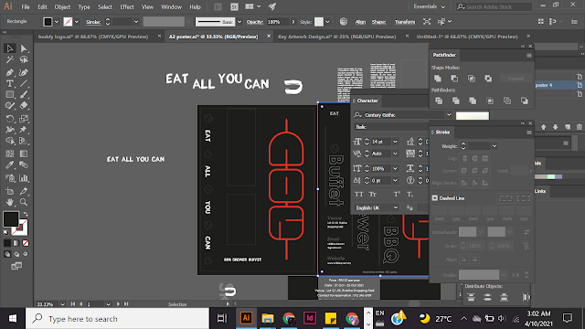
Key artwork design attempt 1.
Key artwork design second attempt.
Progression Key artwork poster design on Illustrator.
First Attempt Poster Design.
Poster design second attempt.
Poster design progression on Adobe Illustrator.
Voucher Design on Adobe Illustrator.
Animating progress on Adobe After Effect.
For the animated invite, I wanted to make it look more fun and energetic, so I used the 3 round form element of the key artwork to make it look like 'loading' effect, and then making it becoming red to convey that it is being grilled or barbequed, suggesting heat and fire.
Animating progress on Adobe After Effect.
I got an idea to make the skewer meats 'alive' and bounce towards and attach themselves onto the skewer stick. But as I progress animating it, I found it very challenging with the movements of 'jumping' and 'bouncing' to make it look like its lively. I also added some music and sound effects such as popping sound and grilling sound.
Rendering process on Adobe After Effect.
Final Submissions
Final Key Artwork Logo Design
BBQ Skewer restaurant logo
Final Key Artwork Poster Design
BBQ Skewer Buffet Event
Final Key Artwork Poster MockupFinal Key Artwork Collateral Design
Final T-shirt Mockup Design, Tote bag Mockup Design.
Final Voucher Design (back)
Final Voucher Design (front)
Final Animated Invite (Sound On)
Final PDF Compilation
*Approximately 50 hours spent on designing this task.
Task 2a : 20 hours
Task 2b : 30 hours
FEEDBACK (Key Artwork and Collateral Design)
Week 6
Specific Feedback : Very exciting, but a lot of colours being used initially. No need to put colours to it first, focus on forms first to not get distracted by it. The black and white design down there looks cool, but maybe the curve of the C can be lesser to be consistent with the other end.
General Feedback : Decide on an occupation or job first and design accordingly to it to represent well. For task 2b, use A2 size artboard for poster design. For font size of body copy on A2 size artboard, use minimum 12pt for good readability. Can test print on 8 piece of A4 papers to see the readability physically.
Week 7
Specific Feedback : For the poster, the texts are too big for an A2 paper. The main spotlight is to be given to the key artwork, not the information. Utilise the key artwork in the poster. Learn to make relevant explanation to your design decision and recognise your conscious thoughts.
General Feedback : When you create your animated invite, make sure your key artwork is being expressed, information is introduced as well. Incorporate your key artwork elements into the poster design, such as the forms and shapes.
Week 8
Independent learning week.
REFLECTIONS
Experience : I struggled a lot in this task, as it was an open brief by using our own initials to design a key artwork logo that represents a job or company excluding design related field. I could not think of what job to choose from, therefore I started off designing the logo first before I decide, but it got me more difficult to think of what job to fit in the design. I literally spent the whole week thinking so hard about the job that would fit into my already half-done design, and finally one day before class, I started to feel my design can fit into some kind of food, and so I went with skewers. Task 2b is also challenging as our poster design can only revolve around the elements found in our key artwork design, and also because it was in A2 size artboard, I struggled initially with the size of the fonts. As for the animated invite, I also struggled because it has been so long since I last used after effects. It took me some time to familiarise myself with the software again.
Observations : This task helped me get more creative in a sense as I get to create forms using letters and also incorporate it into a job or company. It also helped me improve my design and artistic sense, as I found out that I could see design works differently, for instance the design I used to think that is good is actually not that good, and the design I initially think isn't noticeable is actually better than I thought. I also get to challenge myself to design posters with minimal graphical elements, and only using certain design elements.
Findings : I realised that typography can be done in a more graphical way through this task, using them to create logos. I also learnt a new term 'Key Artwork' which is a graphic that looks like a logo but also works with being able to hold as an artwork itself.
Further Reading
https://99designs.com/blog/tips/brand-identity/
This article talks about the necessary steps to create a brand identity effectively. I read ths article and used it as a guide when I was executing my design, such as the consistency of colour pallete, the style, setting the mood of the brand, the CIS or corporate identity set and recognising the distinctive elements that are unique for ones' brand and product, for instance, the form of the letters design that looks like skewers after adding a stick to it.
'elements are what define your brand, and before you start building your brand identity, it’s important you have a clear understanding of each.'
So although this task is mainly about typography, I found this relevant in helping me to complete this task effectively.


Comments
Post a Comment