17/10/2021-15/11/2021 (Week 9-Week 13)
Name : Chan Huei Lian (0351597)
Advanced Typography | Bachelor of Design in Creative Media | Taylor's University
Task 3 :Type Exploration and Application
LECTURES
Week 9 : The class started with a Q&A session. Then, we were briefed about our next task, which is the key artwork design. The final task is an open brief, which requires us to develop and design a font that is intended to solve a larger problem or meant to be part of a solution in the area of our interest. The session continues with Mr. Vinod marking our second assignment, which is the key artwork and collateral, while we brainstorm or research about what we want to do for task 3.
Week 10 : The class started with a Q&A session. Then, we are asked to present our proposal to Mr. Vinod and Mr. Asizul. The lecturers commented and guided us one by one regarding our ideas, and how we could do them. Mr. Vinod then asks us to choose the one best idea that we are most interested in doing for the final assignment. We were encouraged to use Fontforge for kerning later on when we finished designing our typeface.
Week 11 : The class started with a Q&A session. We were asked to post our first attempt design on Facebook. Mr. Vinod commented and gave feedbacks for our first attempt designs and progressions. We were also briefed on how to use Fontforge for our letters kerning.
Week 12 : The class started with our feedback session with Mr. Vinod on our progressions of our final project. Since this week is the last class before our submission on next week, Mr. Vinod briefed us about the expectations for submission for the task.
INSTRUCTIONS
Module Information Booklet PDF.
<iframe src="https://drive.google.com/file/d/18R4RiOQrYJvKhhUdRHv8usUxK3n8xHh6/preview" width="640" height="480" allow="autoplay"></iframe>
First Draft Proposal
At first, I was really clueless on what to do for the final task, because it is an open brief. I started looking for idea by thinking about something that I like, which I am reminded of animals because I love them, and because I have rabbits at home. But just by doing rabbit font seems not enough and not a solid idea. So I thought of animals in general. Then, an idea of making a font for endangered animals came to my mind, and I kinda want to be more illustrative about it and I think it would look nice. But when I proposed this idea during class, Mr. Vinod reminded me about Fontlab and it is difficult to have colours in it when using Fontlab. As I have no prior knowledge or experience to using Fontlab, I decided that I would only stick to the pattern concept of the animals if I choose to do this idea. This concludes my first idea.
For the second idea, initially, I only thought about the idea to make a font design inspired by astrological signs and horoscope because it would look pretty. I also find a lot of existing astrological signs inspires fonts are not so recognisable as a latin alphabet as their shapes and forms are too close to the symbols. So I wanted to make a astrological signs inspired font that is more readable and able to recognise the latin letters better. Then, I explored this idea's applications and decided to try to be experimental the typeface with light projection, something like the star projections often seen in planetariums.
Another reason to this decision is that I wish to promote Planetarium Negara as I think this place does not get much attention from the public, compared to other national attractions such as Zoo Negara, and Petrosains. With this in mind, I decided that my collaterals would revolve around creating a promotional event for special star projection at its space theatre, to create public's awareness about this wonderful place.
As for the third idea, I actually ran out of thoughts for a third idea to propose, so I looked back on my works when I had Typography class during Diploma, and found a typeface design about Halloween that I worked on 3 years ago. I think I could redesign the font, and make a comparison between the remake and the old one. This could be interesting to see as well as it would show how much I have grown being a design student.
After the consultation, I had to decide which idea I want to go with. With much considerations, I finally decided to go with my second idea, the astrological symbols inspired font.
Fig. 1.1 - Research on astrological symbols.
During this first step, I explore and researched about how astrological signs looks like, such as the list of astrological signs and how they could be incorporated into the font design of each letters. After looking at the symbols online, I did some sketching on paper for brainstorming and concept. I decided to incorporate stars (horoscope) and the astrological signs together, that is why all letters have tiny circles to look like stars.
Fig.2 - Progress in Adobe Illustrator.
After sketching on paper, I moved to work digitally. I made a few letters, starting with "A". When working on "O", I had the idea to make it resemble planet orbiting, thus the outer circle and inner circle with "planets" orbiting around the star in the middle. After finishing "O", I used the same design for "G", "Q". Initially, I wanted to just rotate "A" to become "V", but later I made another attempt on the letter, and I was contemplating on which design I should go for. I did "Y" "X" as well, one inspired by "A" which is more of straight lines, but later I found out that I could just use the "V" curved concept for "X" and "Y" again, as it looks better than the straight ones.
Fig.3 - First Attempt Design.
This is the design progress I had for the first consultation class on week 11, Mr. Vinod suggested that I use the rounded concept of "O" on letter "J" as well.
Fig. 3.2 - Amendments for "J" after consultation. (I don't know why but now my "J' reminds me of some brass instrument)
Fig.4 - Second Attempt Font Design
This is the full set letters attempt I had for our second class consultation on week 12. Mr. Vinod suggested that I also add lines for the numbers like I did for the letters so that it looks more consistent. He also added that the circles in my glyphs need to be bigger.
Fig.6 - First Attempt Star Projection Layout Design (Plain) - Lower Part. (A3)
Fig. 7 - First Attempt Star Projection Layout Design (Plain) - Middle & Top Part.(A3)
This is the first attempt on star projection lantern layout I had for our second class consultation on week 12. Mr. Vinod asked me to proceed to printing to try out if it is working out.
Fig.8 - Final Star Projection Layout Design Lower Part. (A3)
After the layout design was done, I continued to place the designed letters randomly to fill up the space of the layout. Then, by using pathfinder, I subtracted the details in the letters so that it is transparent on the black space. This is to ensure that I get transparent letters when it is printed on OHP sheet later on.
Fig.9 - Final Star Projection Layout Design Mid & Upper Part. (A3)
TEST PRINTS ON NORMAL A3 PAPER
Fig.10
Fig.13
Before printing on OHP sheet, I tested out first by printing on normal A3 paper because it is cheaper, and I would be able to amend anything that is inaccurate or not working out before printing it on the actual material. After test print, I tried making the projection lantern by fixing the pieces together, and fortunately, the measurements are correct and I can proceed to the next step, which is the actual printing on OHP.
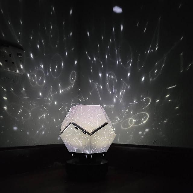
ACTUAL PRINT ON OHP SHEETFig. 14 Star Projection Printed on OHP paper.
I faced a lot of difficulties while I was cutting and fixing the plastic paper layout together, it took me the whole night to get it done, as the plastic is a more slippery material, it does not work well together when I fixed it, unlike the normal A3 paper material that I previously test printed, which is easier to be fixed together.
Fig.15 - Left : Test print on normal A3 paper, Right : Final Product printed on OHP sheets.
Fig.16
View of the product from inner. The designs are able to be seen through the OHP sheet.
Light is able to pass through easily.
Fig.16.1 - Application creating progress. (Letter 3D extrusion)
Fig.16.2 - Application creating progress. (Letter 3D extrusion)
I got an idea feedback from Mr. Vinod during class consultation that I could try to make a chandelier out of my font design. I thought that it is a great idea and decided to try it out. Initially, I am pretty clueless on how I should make it, as it is considered to be difficult for me. So, I created 3D versions of the letters, using photoshop as shown in figure 16.1 and 16.2, by creating 3D extrusion after importing the vector from Adobe Illustrator to photoshop.
A significant difficulty that I met during this process was that my photoshop could not handle 3D well, and often shut down on its own halfway. So I had to recover the files, and sometimes redo again when it was not saved or recovered. This process took me almost a whole day.
Fig.16.3 - Application creating progress. (Chandelier mockup)
After the 3D letters were done, I began to make the mockup of chandelier. Placing them decently was really a challenging part, I always find it to be off and 'cacat', but I tried my best to make it look at least recognisable as a chandelier.
Fig 16.4 - After I photoshopped it, I had an idea to animate it to show some glowing effect as right now it looks like its light button is not switched on.
Fig 16.5 - Hence, I imported the psd file into after effect to animate glow on the pieces of letters.
Final Outcome
Fig.17 - Stargaze Typeface Final Design.
FINAL APPLICATION 1
Fig 18 - Final Picture 1 (Star Projection)
Fig. 19 - Final Picture 2 (Star Projection)
Fig.20 - Final Picture 3 (Star Projection)
Fig.21 - Final Picture 4 (Star Projection)
Fig.22 - Final Picture 5 (Star Projection)
Fig.22.1 - Final Picture 6 (Star Projection)
Fig.22.2 - Final Picture 7 (Star Projection)
Video shot Star Projection.
video ver (mov file with sounds)
FINAL APPLICATION 2
Fig.23 - Billboard gif mockup for Planetarium Negara.
Billboard mov mockup for Planetarium Negara.
FINAL APPLICATION 3
Fig.24.1 - Chandelier design. (Gif)
Fig.24.2 - Chandelier design. (mov)
Fig.24.3 - Chandelier design. (jpg)
FINAL APPLICATION 4
Fig.25 - Journal merchandise for Planetarium Negara.
FINAL APPLICATION 5
Fig.26 - Card Invite for Planetarium Negara.
FINAL APPLICATION 6
Animated Short Video Teaser for Planetarium Negara.
Fig.27 - Final Flat Lay jpg.
*Approximately (60) hours spent on designing this task.
FEEDBACK (Key Artwork and Collateral Design)
Week 10
Specific Feedback : All 3 ideas are good, just need to make a decision which to choose. Idea 1 : can have 26 most endangered species animal . Idea 2, design needs to be a bit complex so that it would look good as you expected later on when making the star projection. Idea 3 ; can try black and white for it and see how it goes.
General Feedback : Only use black and white, because its easier to do it in fontlab later on for kerning purpose.
Week 11
Specific Feedback : Nice design, looks very zodiacal. Can explore many possible applications apart from the star projection, for instance to do mock ups for, lamp shades using different materials, chandeliers, wall mural, video clips of fonts forming and becoming a word.
General Feedback : Keep letters consistent in weights, width. Use fontforge to do letter kerning.
Week 12
Specific Feedback : OHP sheet would be the right material to test and print your project. On DSLR, switch to shutter priority for longer exposure.
General Feedback : Next week submission for task 3.
Week 13
Specific Feedback : Well done. Label your Fig. ?) images. PDF file not visible. Shoot more images of your creation and its projection. A Gif would be great. Not suitable for bill boards unless its BACK LIT and the text glows. Well done madam. But a lil more work needed on the application.
General Feedback : Submission of final compilation of Task 1, 2 & 3 and reflection next week (week 14).
REFLECTIONS
Experience : I generally enjoyed this task, from the beginning stage, which is the proposal. As this task is an open brief, I have more freedom to create anything I wish to, but initially I did not have a clear idea on what I should be doing. After doing research, I finally settled down with 3 ideas, and eventually sticking to designing a font that is inspired by astrological signs and stars. I also have the idea to experiment the typeface with light projection, which is inspired by planetariums' star projections. On the later stage, I got the idea to promote awareness about our National Planetarium, which is Planetarium Negara. So I created mockups to celebrate the planetarium's 28th anniversary, which is actually 7 of Feb 2022. However, I was overwhelmed by the clashing assignment datelines of a few different modules, that made me have lesser energy and motivation to complete this work with full spirits. As a result, some of my initial plans for this projects were cut off, and I compromised with easier tasks to ease my heavy workload.
Observations : These few weeks have been really fun and interesting, as I got to see my peers' ideas and designs, which are all very good and inspiring. This is because of the open brief nature of the task, which allows students to be more creative and innovative, and think out of the box.
Findings : I found out that Typography is actually more than just a font, it can be applied to almost anything, if we could sit down and think carefully about its application and potential uses, some interesting ideas might pop up. This task have been very enjoyable, despite some stresses and sleepless nights. And I am happy that I get to do some hands-on work, which reminds me of packaging design in my diploma years, when we needed to do test print for almost everything, which I actually hated it because it costs too much for my wallet to handle. But I guess doing it occasionally is actually enjoyable.
Further Reading
https://www.printerland.co.uk/blog/guide-to-printing-transparencies/
https://99designs.com/blog/web-digital/font-design/
This website gave me insights and guidelines on crafting my font design.
Letters can also be grouped into certain categories based on their shape, and it helps to recognize these in order to draw them consistently. These are rectilinear, curvilinear, and triangular letters (picture squares, circles, and triangles).
- Rectilinear letters include H, E, and N
- Curvilinear letters include C, O, and G
- Triangular letters include A and V
Designing with Type by Craig James, Korol Scala Irene, William Bevington.
This book talks about how to design a font, the Type Terminology, and have useful tips on the line spacing and leading of font. It also teaches us how to apply typefaces on projects.
Meanwhile, it also has tips that are beneficial if we are designing fonts, and also emphasizes about punctuations, which helps in designing glyphs and deepen understandings about them.
"As readers, we tend to see words in terms of the messages they
convey, and are rarely conscious of the actual shape of individual
letterforms. Only when we examine letters closely do we see how
complex and visually elegant they are.
Have you ever taken the time to examine a letter closely? Let’s start
right now by considering the many intricate shapes inside and around the
letterforms and how they interrelate."
LOWERCASE | The small letters of the alphabet, often indicated as
lc.
When combined with uppercase, they are indicated as
BASELINE | An imaginary line upon which the characters seem to be
standing.
MEANLINE | An imaginary line that runs along the top of most lowercase
letters, such as a, c, e, i, m, n, u, v, w, and x.
X-HEIGHT | The height of the body, or main element, of the lowercase
letterform, which falls between the meanline and baseline. This
measurement is called the x-height because the strokes of the
lowercase x terminate at the baseline and the meanline.
ASCENDER | The part of some lowercase letters, such as the strokes on
the letters b, d, or h, that rises above the meanline.
DESCENDER | The part of some lowercase letters that falls below the
baseline, such as the strokes on the letters p, y, and g.
COUNTER | The space entirely or partially enclosed within a letterform,
such as the enclosed “bowl” of the letters b, d, and p.


Comments
Post a Comment